Soluna Yoga Studio
Brand / Identity / Digital

Client:
Soluna
Scope:
Brand / Identity / Digital
Year:
2025
Soluna blends Sol (sun) and Luna (moon) to describe a yogic practice that is deeply connected to the rhythm of nature. With offerings that range from foundational classes to experimental and creative sessions for seasoned yogis, the studio prides itself on being an inclusive space that welcomes all abilities.

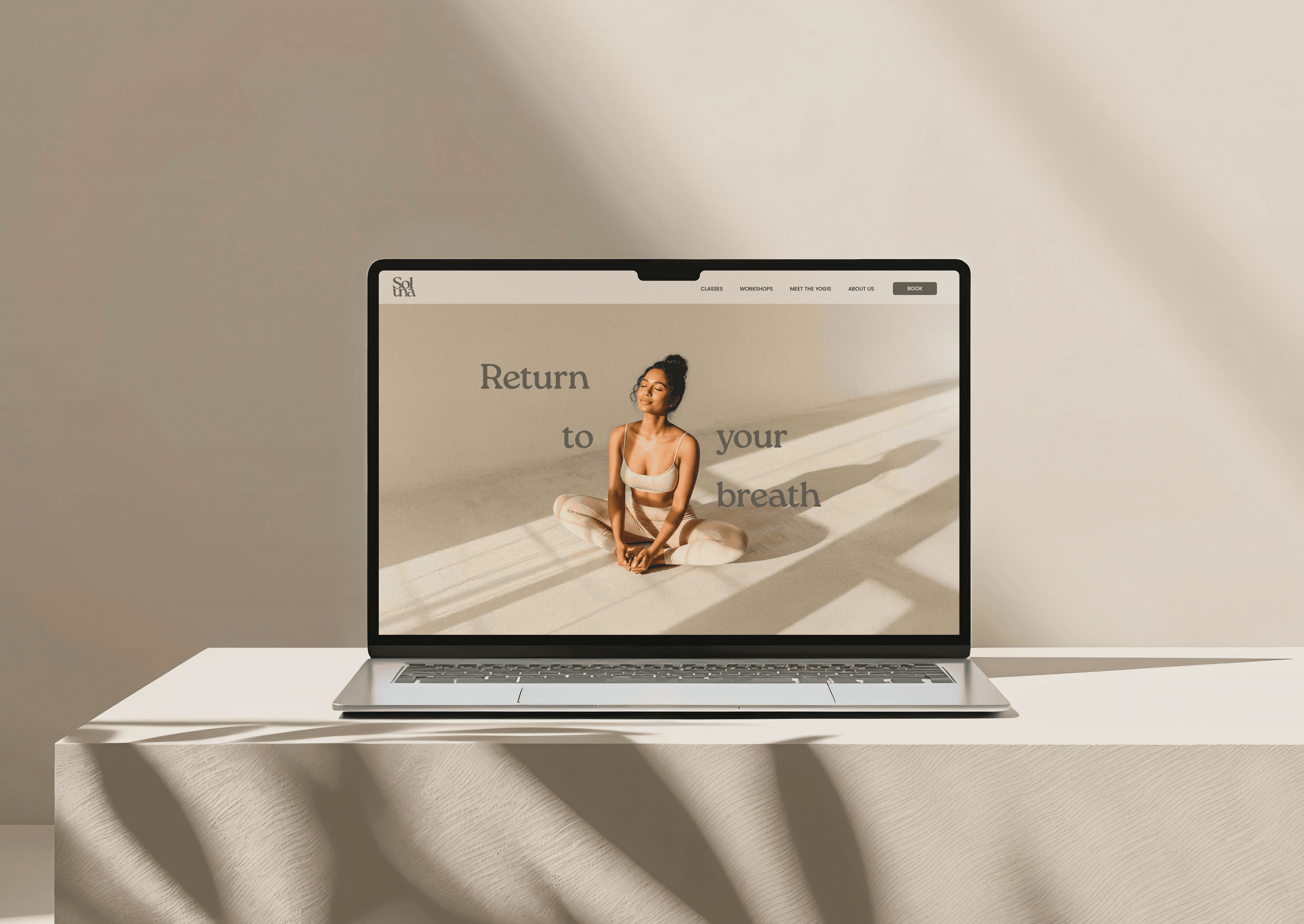
The Visual Identity
In developing the brand identity, it was important to express the studio’s core values through the logo. The soft, rounded letterforms of the logotype hug closely together, evoking warmth and inclusivity, while a grounded, earthy colour palette roots the visual system in nature — Soluna’s ultimate source of inspiration.


Studio Icons
Inspired by the circular “O” in the Soluna logo, a series of icons were crafted to represent the studio’s four core types of yoga practice. The “O” serves as a symbol for the breath – the universal thread that connects all practice at Soluna.


Back to all projects